
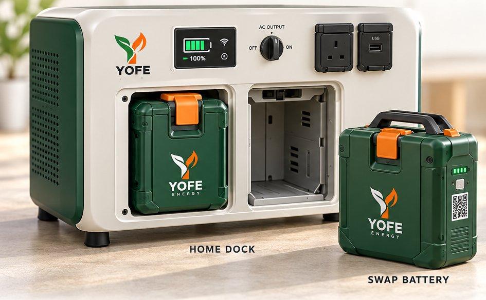
A battery-swap proposition needs more than a product photograph. It needs a clear explanation of how the service fits into everyday life.
Explain the experience before the specification
YOFE Energy presents home battery-swap systems for homes, shops, and offices, with optional solar. That introduces a different decision from buying a familiar appliance: visitors need to understand the system and the service around it.
A useful energy website starts with a simple journey. Explain how a customer chooses a system, how charging and swapping fit together, and where to ask about availability. Technical detail becomes more useful after that basic picture is clear.
Turn comparisons into decisions
A row of product names can leave people with the same question they arrived with: which one is appropriate for me? A clearer comparison connects each option to the information needed for an informed enquiry, rather than treating the largest model as the default choice.
For an energy product, examples should state their assumptions. Equipment needs and usage patterns vary; a website should help visitors prepare those details for a conversation rather than promise universal runtime or savings.
Give uncertainty a useful next step
Not every visitor will be ready to reserve a system. An enquiry route can ask about the intended setting and the equipment the visitor wants to support, then explain what happens after submission.
The design opportunity is to make an unfamiliar model understandable without stripping away its complexity. Plain language at the beginning and useful detail further down serve different stages of the same decision.
Show a realistic enquiry example
Imagine a shop owner who knows which equipment they use but has never compared a battery-swap service. A useful page can show the information to prepare: the equipment involved, the intended setting, and the questions to discuss with the team. It does not need to turn that example into an unsupported recommendation.
Keep the example clearly separate from a product promise. The visitor should understand that the next conversation establishes suitability and service details. This allows the website to educate without implying that one arrangement works identically for every customer.
Keep the service information current
For a service-supported product, availability and coverage information deserve the same attention as the product photographs. Assign responsibility for checking those details when the offering changes. A reservation action should explain what it starts and what confirmation the customer should expect.
Review recurring questions after launch. If visitors consistently ask how swapping works or where an enquiry leads, the explanation may need more detail. Those questions provide a practical way to improve the page, without assuming that a visually polished introduction has answered everything.
Put it into practice
Key takeaways
- Explain the customer journey before presenting a specification table.
- Make comparisons about suitability, not simply product size.
- State assumptions and give visitors a clear way to ask questions.
References & further reading
Explore YOFE Energy (opens in a new tab)